
Design Challenge #1: Sweet 16 Party
Uijun Park

01. Design Principles
It's always important to set a design principle before designing a product or a service. For redesigning Sweet 16 Party page, I used following design principles that can be directly applied. They are already proven design principles in graphic, UX, UI design field.

1. Proximity
Proximity helps creates organization. By grouping similar elements together or in close proximity, you create a relationship between those elements.
Source: The Principles of Graphic Design: How to Use Proximity Effectively
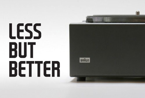
2. Less, but Better.
Good design is as little design as possible – because it concentrates on the essential aspects, and the products are not burdened with non-essentials. Back to purity, back to simplicity.
2. Research
Based on the design principles above, I checked current page and found problems that need to be solved or improved.
2.1. Structure

(1) Analysis
What is expected user behavior for each element?
I found that "Title" is there for letting user know about the page at once. "Search" and "Most requested vendors" is there for user to find vendors. Lastly, "Featured Article" is for reading about a story that is relevant to this page.
(2) Problem
Considering the flow of user's view, "Search" and "Most requested vendors" is not grouped together.
Ironically, "Most requested vendors" and "Featured Article" is grouped together. This can be problematic because user can misunderstand that these two are related to each other. On the other hand, users can possibly think that "Most requested vendors" is not related to "Search"

One good way to solve this problem is to regrouping elements that are relevant. In this case, putting "Search" and "Most Requested Vendors" close to each other is going to be the solution.

2.2. Heuristic Evaluation for each part
I implemented heuristic evaluation for each part in Sweet 16 Party page. A heuristic evaluation is a usability inspection method for computer software that helps to identify usability problems in the user interface design(Source: Wikipedia). More detail about heuristic evaluation principle is here.

3. Solution
3.1. Desktop Experience

What has been changed?
(1) Structure
"Grouping relevant items"
I grouped "Search" and "Most requested Vendors". Now, user will find these two features are there for help them find vendors.


(2) Title
"Party is a colorful experience."
Instead of using monotone color, I used color photo to help user feel how the party will be like.

(3) Most Requested Vendors
"Less, but better"
First of all, there were too many items that users are given in the "Most Requested Vendors." This is can be overwhelming. I reduced the number of items and simplified it. (Relevant article: Law of Simplicity) Also, I added photos to each item to help users understand it more intuitively.
(4) Featured Article
"Enhanced readability"
As I mentioned, current version has too much words. Users can be overwhelmed by this. Also this part is jammed by "Search" and "Most requested vendors". So it can be difficult for user to concentrate on this.

3.2. Mobile Experience
Regarding mobile experience, I applied what I changed in desktop experience to mobile version. Plus, I refined the left and right scroll experience for "Most requested vendors" and "Related articles". Instead of having left, right button, it is more natural for user to use swipe left and right in mobile. So, I changed the experience.
