KPCB Design Challenge
Uijun Park | MFA Interaction Design, School of Visual Arts
01. Challenge
How can we differentiate DoorDash's user experience from its competitors?
02. Trend Research
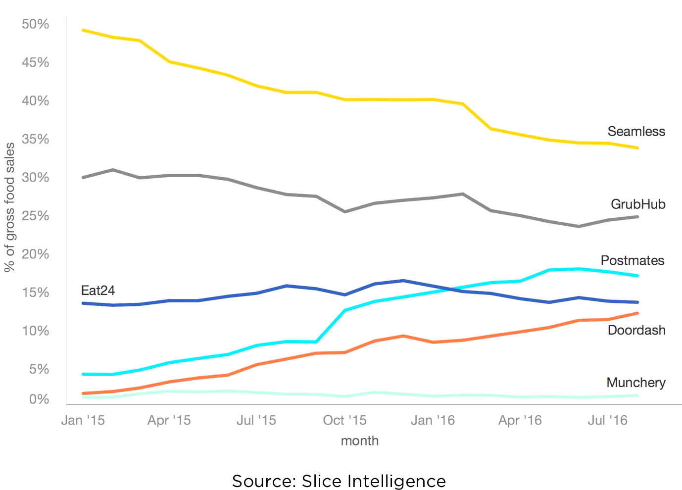
Competition is rising in the food delivery app industry is becoming!
Many competitors are emerging and growing very fast and threatening DoorDash’s position. I compared DoorDash and other similar apps in terms of user experience they provide to validate this assumption.
03. Problem
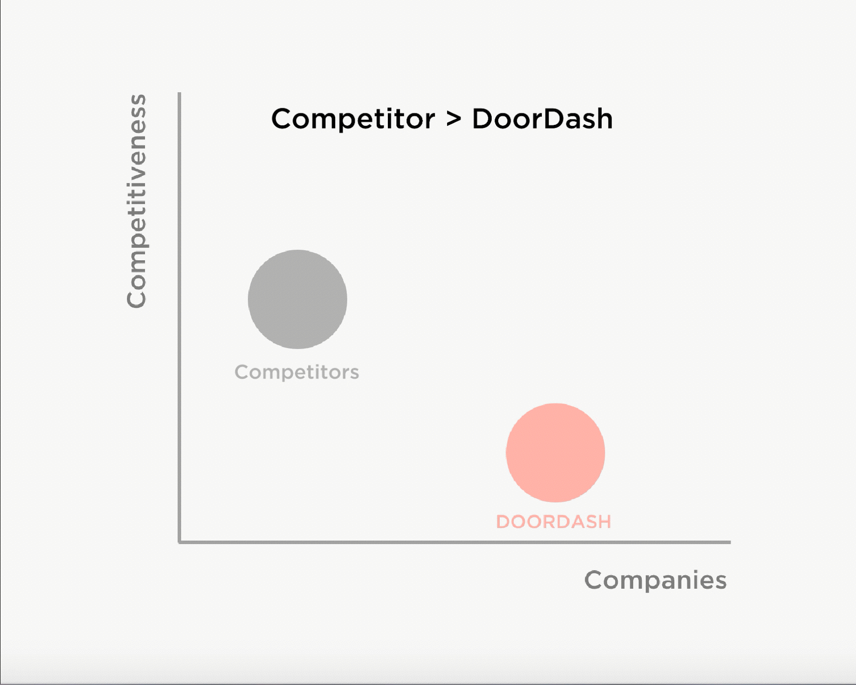
Compared to other food delivery service apps, DoorDash is missing an opportunity to connect customers with the food they want to order.
I assessed DoorDash by implementing a competitor analysis. By doing this, I found DoorDash is not competitive compared to others for the following reasons.
1. No photos of foods for restaurants. When users use a food delivery app, one of the most important thing is that knowing which restaurant provides which foods. The best way for the service is to covey food photos. With the photos of food, user can figure out if the food restaurant is providing looks tasty, or if it is what they are looking for. Competitors of DoorDash are providing photos of the most popular dishes of each restaurant. However, DoorDash is only providing the logo of each restaurant. It is really difficult to figure out if the restaurant provides what they want to eat.

2. No moments of delight. (Uniques or Attractive Feature) DoorDash doesn't have an attractive feature that captures a user's attention and differentiate their company from other companies. For instance, Seamless is providing star ratings and reviews for each restaurant. Even if this is a very common feature in food related apps like Yelp, Seamless differentiated their service by providing this.

04. 1st Solution. Adding photos of foods
We found that DoorDash is not providing photos of foods which other competitors are all doing. So I added photos of foods to each restaurant. Now, it looks more appetizing. This will give users a better understanding of what they should expect from each restaurant.

Adding photos of foods lets DoorDash have even competitiveness with its competitors.
05. Creating Delightful moments
Now, where in the user experience can we create delightful moments that will make DoorDash greater than its competitors?

Opportunities: Premium Experience
1. Jiro's Sushi Bar - Chef's Personalized Recommendation
Jiro's sushi bar is one of the best selling sushi restaurant in Japan. They provides food in different ways compared to the general sushi bar. Instead of letting customer chooses food from the menu, the chef recommends today's menu. The unique thing about this is that each customer is recommended with different specials of the day. This can be possible since the chef knows what each customer wants and prefers.

2. Growth of the Premium Food Delivery Market
Premium food delivery services are emerging and their market is growing. They provide foods made by their internal chef or from high-end restaurants. This means that demand for more expensive but higher quality foods is growing as time goes by.


06. Ultimate Solution

How it works
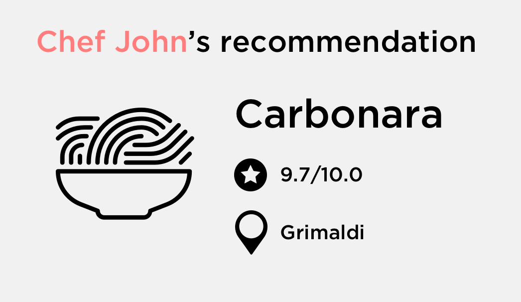
1. Chef's recommendation
Good news! Now, users can experience reliable and tasty food without consuming time on searching for restaurants and foods. Users can simply follow a notable chef and subscribe to his recommended foods. New recommendation of foods will be posted in the "Chef's Choice" menu.

2. Personalized experience
User will be recommended food menu based on their food preference. For instance, they can choose what kind of allergy they have for certain foods or can subscribe to vegetarian food.
3. Feature built in addition to DoorDash's previous features.
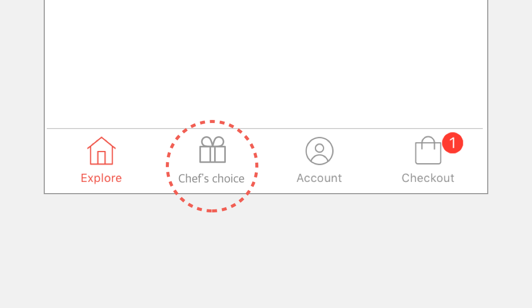
User can still use DoorDash's industrialized feature("Explore" menu). This "Chef's Choice" feature will be provided as a separated menu. "Order" menu that was positioned in 2nd menu will be provided in "Account".
User Interface
1. Getting Started
At the beginning, users are asked to choose their preference on foods, allergy information, and the chefs they want to follow. Once this process is done, users will get feeds from chefs they follow.

2. Browsing and Ordering Food
Users can browse foods that chefs recommend and order the food with one click.

3. Chef's profile
If users click the chef's photo on the main page, they can view that chef's profile. They can see other posts that chefs have uploaded so far. Also, this page includes how many followers the chef has, how many posts he’s uploaded, and so on.

Design Process
The result of the product was not made at once. I kept iterating an idea, its design, user flow, and prototypes until I found the best solution.
1. Brainstorming
At first, I had two ideas for the main page of "Chef's choice". Plan A was a vertical feed where users can browse options by scrolling up and down. Plan B was a horizontal feed where users can see feeds by flicking left and right.

2. User Testing
To arrive to the best solution, I implemented user testing with people who use food delivery service apps. I picked people who live in urban areas(major user group of these services) and who had experience of ordering food through mobile apps. From this activity, I found that users wanted plan A more since they can view more feeds at a time.

3. Building user flow
Based on user testing, I decided to go with plan A. And I started build user flow.

4. Design Style Guide
For creating a design style guide, I tried to make this feature harmonize with other features such as the ”Explore" screen. So I reused the previous color theme and added only one more color(Blue). Also, I kept the San-Serif font that DoorDash already provided. For the same reason, I wanted to make a consistent mobile user experience.

5. Prototyping
Lastly, I made a prototype animation using the Principle App. It's useful when I need to describe how UI works.

Thoughts
"Chef's choice saves so much time for searching restaurants and foods."
- Sara B / DoorDash user
"When I want to explore a new menu, I always get recommendations from my friends. This new experience will do a perfect job at that."
- Young K / Seamless User
When I saw this challenge on the KPCB website at first, I was so excited since I could practice what I’ve learned from my school and my career as a UX/UI designer. Throughout the entire experience of this activity, I thoroughly enjoyed it. One good thing about this challenge was that I had a freedom to pick an interest area that I am passionate about and go with it. Since I love using food delivery services, I chose DoorDash for this challenge. I hope the result from this activity helps food delivery apps provide better user experience to customers.
Thank you!