Vendor Profile
Redesign to Drive Lead Growth
Summary: Redesigned The Bash’s vendor profile page to improve usability and boost lead generation, increasing conversion.
ROLE
Senior Product Designer
TEAM
Product Manager, Front-end & Back-end Engineers, Content Strategist, SEO Manager
CONTRIBUTIONS
User Interviews, UX Flows, Wireframing, Prototyping, High-fidelity Design, User Tests, A/B Testing
Timeline
Q1-Q2 2022
Platform type
Web (Responsive)

Project Backgrounds
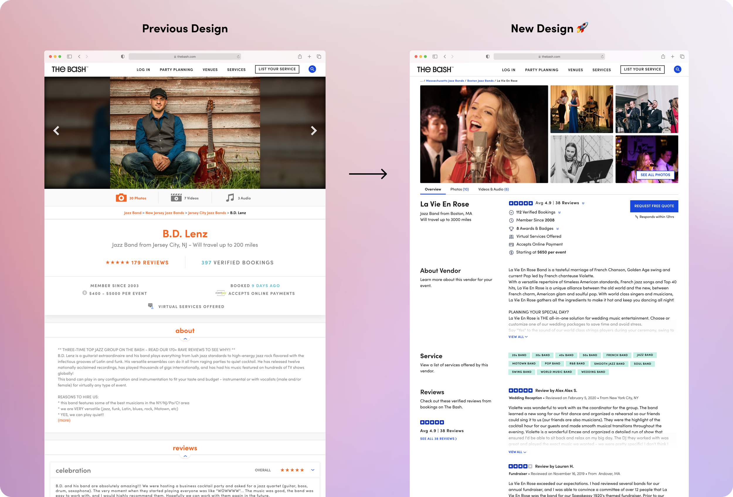
The vendor profile is one of the most business-critical pages on The Bash, driving a majority of vendor leads and bookings. However, the page had remained unchanged for over five years, using outdated layouts, colors, and UI components.
When the company initiated a full rebranding, I saw an opportunity to modernize the user experience—improving usability, aligning with the new brand colors and system, and ultimately increasing lead generation.
What is The Bash? The Bash is a leading online marketplace for event planning that helps more than 1M monthly users discover and book trusted vendors—from DJs and photographers to entertainers—for all types of celebrations. The Bash on Trustpilot: ⭐ 4.8 · 20K reviews
Key updates
I redesigned the vendor profile experience to improve gallery usability, information scanability, vendor availability clarity, and more.
Introduced an enhanced gallery that allows users to browse multiple images and videos at once.
Added an vendor availability feature to the vendor calendar based on user feedback.
Improved layout readability and information hierarchy

User Interview & Problems
To better understand the challenges users faced on this page, my PM and I conducted user interviews and usabilty testing with The Bash users, and non Bash users in order to identify the following key issues. We also reviewed analytics and user feedback submitted through customer center, NPS feedback to identify friction points.
Problem 01
Gallery usability issues
The top gallery is one of the most important sections on the profile page, but the previous design only allowed users to view one image or video at a time, making it difficult to quickly browse and compare multiple visuals.
“I just want to glance through a few photos quickly…” - Sabrina

Problem 02
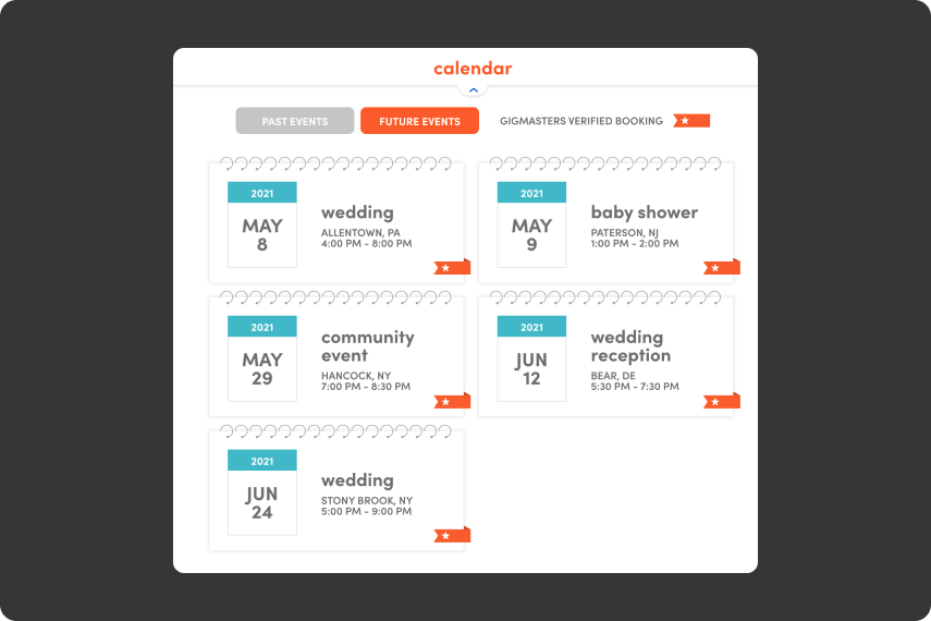
Misaligned user expectations for the calendar feature
The existing calendar showed which events vendors were booked for on specific dates. While this content helped drive page traffic from an SEO perspective, users themselves were not particularly interested in it. Instead, they were more focused on checking whether the vendor was available on their own event date.
“…I don’t care about their booked events — I just need to know if they’re free on my date…” - Ashley
Problem 03
Scanability & Readability issues
Users who spend more time on this page tend to generate more leads, highlighting the need for quick information scanning.
However, user interviews revealed that the dense layout, small font size (13px), and long text lines made it hard to find key information efficiently.

How might we..
Enable users to view and scan more images at a time?
2. Allow users to check a vendor’s availability more easily?
3. Help users scan each section more efficiently?
Research, Design Iteration, and User Tests
My PM and I researched competitor platforms to identify opportunities to improve the vendor experience, then iterated and validated solutions through user testing.
01. Competitive research & brainstorming workshops
Together with the PM, I conducted a competitive analysis and shared the findings with the team. We then hosted brainstorming and sketching workshops, inviting stakeholders from Product Management, Engineering, Marketing, and Account Services to generate ideas from diverse perspectives.

02. Redesigning the Gallery
I researched how competitors showcased their galleries and identified opportunities to improve visual discoverability. Through several design iterations — from a single-image view to a multi-preview prototype — we refined the gallery into a collage-style layout. Usability testing confirmed that users preferred this approach as it let them view more images at once, grasp the vendor’s style faster, and decide more easily whether to explore further.

03.Redesigning the Calendar
The initial concept aimed to enhance the vendor calendar by displaying booked events in a timeline view, which would require about two months of development.
User test results:
However, during usability testing, we discovered that users weren’t interested in the vendor’s booked events—instead, 3 out of 5 participants wanted to know whether the vendor was available on their own date. This insight led us to pivot the direction and introduce a new “Vendor Availability” feature instead.

Final calendar version 👍
Based on the user feedback mentioned earlier, we decided to add a new feature that displays the vendor’s availability.
However, since the vendors’ booked events content still plays an important role from an SEO perspective, we chose to keep it on the page.
Impact & Outcome from the calendar update 📈
Avoided ~2 months of development work (saving development costs).

04. Optimizing Section Order through A/B Testing
To determine the optimal section order on the Vendor Profile page, I collaborated with my team to explore multiple layout options through card sorting. We then reviewed multiple variations and selected the one that prioritized high-value items at the top of the page. Then, we made a decision based on testing.

Project Outcome 📈
The six-month project led to measurable results after launch: the lead generation rate rose to 4.9% from 4.7% (4% increase), based on year-over-year data.
*Lead generation rate = % of monthly marketplace visitors who submitted a gig request.
These results are based on year-over-year (YoY) data, comparing performance metrics before and after the redesign.
Reflections
One key learning from this project was the value of partnering early and consistently with PMs, engineers, and content strategists. This alignment not only ensured our design decisions were feasible but also turned potential roadblocks into shared wins.